 |
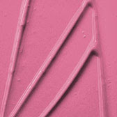
| Image from this paint website Paint Quality |
Mac's foundation shades are the most well known in the make-up world and the easiest with which to identify. They have two colour ranges with two different undertones NC which has a yellow undertone (NC= Needs Cool) and NW which has a pink tinge.
Illamasqua has an amazing collection of model shots of all three different undertones HERE. Just hold your mouse over the foundation swatch and both a male and a female model picture will pop up. In the description it will say either pink (cool), golden (warm) or neutral undertones. It's one of the best guides to undertones I've seen. Another way to check your own undertone is to go outside in the sunlight an look at the veins on your arm. If they appear bluish, then you are cool. If they appear greenish, you're warm. If they appear blue-green you're most likely neutral. Personally I tend to be neutral with a slight warm leaning.
So how is knowing the undertones for things useful? It makes it so something doesn't stick out like a sore thumb. Cools go happily with other cools and the same with warms. Neutrals can go either way. For example, most nudes don't look nice on me. But pink nudes which I was first drawn to, ended up looking miserable on me. I got Estee Lauder's Pink Berry in a Gift with Purchase and was excited thinking I would finally have a nude that had enough colour to it that I wouldn't look dead. I was very very wrong. Why? Because I have a slight yellow undertone to my skin which is warm and the lipstick is cool. I recently found a nude that I didn't think would work on me at all. The Faerie Glen from Mac's Tartan Tale is a slightly brown-orange nude, but I put it on and wow, it looked great! Nicest nude I've ever tried on (I've asked for it for my upcoming birthday).
Here's some actual Mac lipstick swatches from their website.
Both are fairly similar pinks, almost the same shade. The difference, is the one on the left has a warm undertone and and the one on the right a cool undertone.
 |
| Left is Innocence Beware lipstick a Yellow based light pink (Swatch picture from Temptalia's Blog, many thanks to her) |
 |
| I Like It Like That Mac Lipstick (cool) |
The easiest way to decide the undertone is by seeing if the colour leans more toward a purple-berry colour or toward a brick-red, rusty colour. If it's purply its cool if it's orangey it's warm. Red is very much the same. Greens can be warm and cool toned as well. You can often see this in Nail Polish green colours. Ones that are more kahki coloured are warm toned and ones that are closer to turquoise.
 |
| Blue/Cool green (Image from www.fineartstore.com) |
 |
| Yellowed/Warm green (Image from www. susanjablonmosaics.com) |
Though if you're warm you can wear cools and vice versa, things tend to look nicest when you keep all the colours you're using in the same stream as both warm and cool tends to clash. So if you go warm, go all warm and neutral. If you go cool go all cool and neutral.
So what do you think was this helpful? Or was it way too in depth and boring? Let me know! :D

this was very useful!
ReplyDelete